
Objective
Improve data quality and increase the conversion rate of the research programme registration form, enabling strategic recruitment goals.
My role
I led discovery and design to improve participant data capture, working closely with data analysts, engineers, and compliance leads to ensure the form balanced usability, quality, and regulatory requirements.
Problem
Accurate registration data is essential for a smooth participant experience and fulfilling partnership obligations with NHS Blood and Transplant.
- 2.21% of user accounts have incorrect birth dates, names, or both, necessitating labour-intensive manual matching.
- Participants are unable to complete in-person appointments due to incorrect information, with an average of six such cases per month, harming the participant experience.
- Incorrect email address entry prevents users from verifying their emails, halting the registration process.
Discovery
Stakeholder mapping
I mapped each collected data point to stakeholders across the business to understand the downstream impact and clarify the importance of each field. This allowed me to have a holistic view of the value of each piece of data, ensuring vital data collection was maintained in a new experience.
User insights
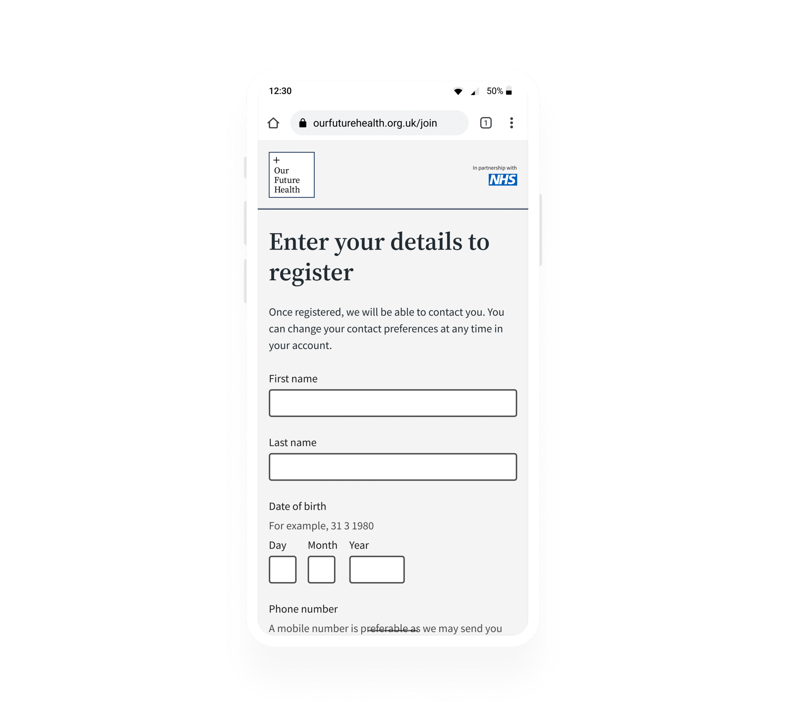
The existing single-page form met usability expectations but contributed to data errors. Previous testing of “one thing per page” designs confirmed ease of navigation, clarity, and familiarity.
Behavioural science and best practice
Multi-page forms are proven to reduce cognitive load and improve completion. The goal gradient effect suggests motivation increases as users progress through a process.
Example user need

As someone who wants to join the health research programme, I need to provide my details quickly and with minimal friction, to create my account and continue the sign-up process.
Example hypothesis
We believe that simplifying the registration process by splitting it into multiple screens will improve data quality and form completion rate by reducing cognitive load and leveraging the goal gradient effect.
Design and ideation
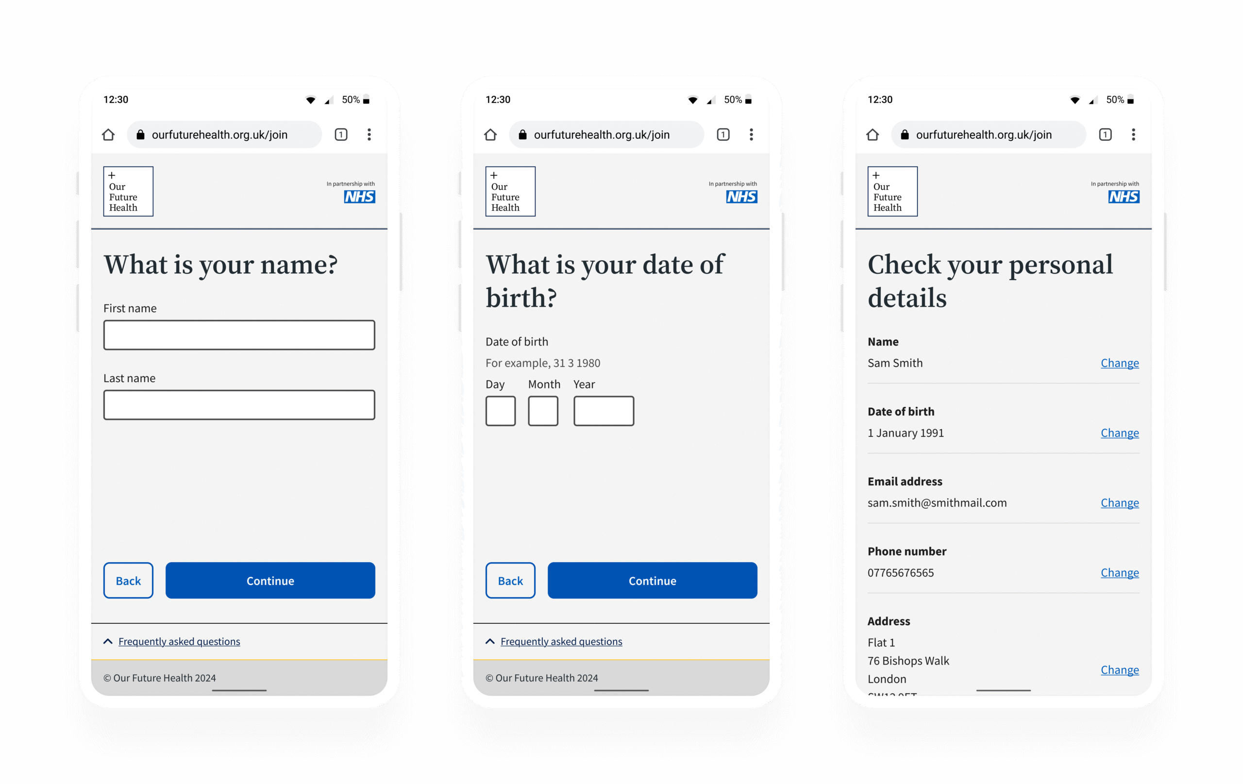
Confident in the approach, I designed and prototyped the multi-page form in collaboration with engineers using design system components. Key features included:
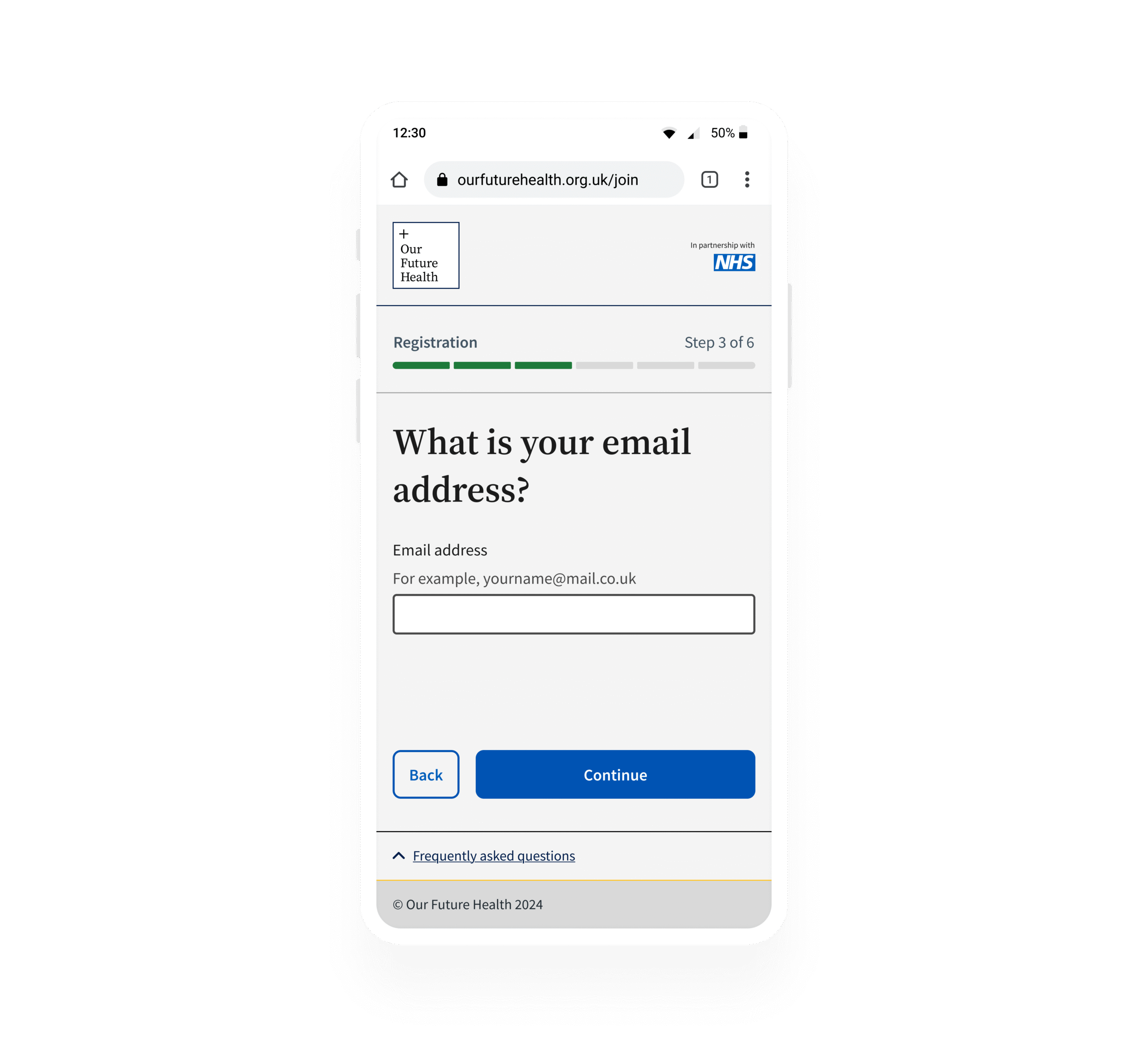
- One data point per page to reduce cognitive load
- Email confirmation field to catch typos before submission
- “Check your details” screen for review before final submission
Experimentation and testing
An A/B test showed:
- More email validation errors were caught, preventing incorrect submissions and “dead end” verification states.
- Registration rate increased by 1.1 percentage points (95% confidence).
Outcome
The multi-page form improved data quality and reduced errors:
- Expected monthly impact: 1,769 additional registrations, 660 fully signed-up participants.
- Profile mismatches among NHS Blood and Transplant participants dropped from 2.21% → 1.15% (48% reduction).
- Monthly appointment cancellations fell from 6 → 3.5 (40% reduction).
- 80% reduction in devops requests to address accounts where the participant had entered an email address with a typo.
Continuous Improvement
Further optimisations, like removing confusing hint text, increased registration rates by 0.4%. Future work will focus on building trust by explaining why each data point is needed and visualising progress to motivate users.
Reflection
This project strengthened my ability to translate behavioural insights and technical constraints into scalable, data-driven design improvements that measurably enhanced participant experience.