Problem
- The NHS App Online, a browser-based version of the NHS App has low usage and is not readily accessible from the NHS website, potentially disadvantaging non-smartphone owning citizens
- The language used around NHS App and NHS App Online is confusing to users
- Raising awareness of online health services is a priority for NHS England since there are now more than 22 million active NHS Login users.
Objectives
- Create a seamless experience from the NHS website into online health services
- Improve the usability of the NHS App Online for users who do not have a smartphone or access to the native app
- Leverage the large user base of NHS App users and help them understand the different ways they can access online health services
Discovery
Working with our user researcher, I co-facilitated a design thinking workshop which allowed the team to identify user needs and understand the scope of the work. We mapped:
- What a user had to do
- What doesn’t work well and design questions
- Who is responsible for that stage of the journey
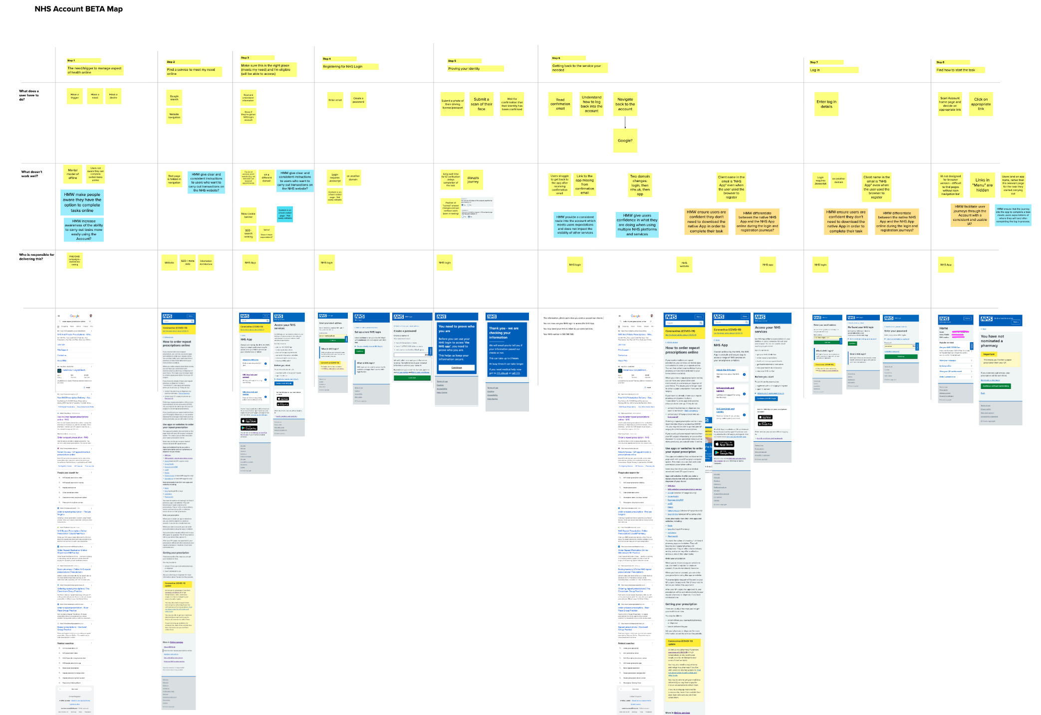
Example user need

As someone who wants to order a repeat prescription, I need to be able to access my account easily from the NHS website in the context of my current journey
Example hypothesis
We believe that adding contextual access to the NHS Account will improve visibility and knowledge that NHS services can be accessed from the NHS website
We believe that adjusting the language used to describe the NHS Account to align with user expectations will reduce confusion and improve understanding of what the Account is for
Using our knowledge of the problems currently facing users, I created design hypothesis to help inform potential solutions that met user needs. I also mapped the complete journey to identify opportunities for improvement at every stage.
Design and ideation
Design questions
How might we ensure users are confident they don’t need to download the native app in order to complete their task?
How might we differentiate between the native NHS app and the NHS app online during login and registration journeys?
How might we facilitate journeys through the account with a consistent and usable UI?
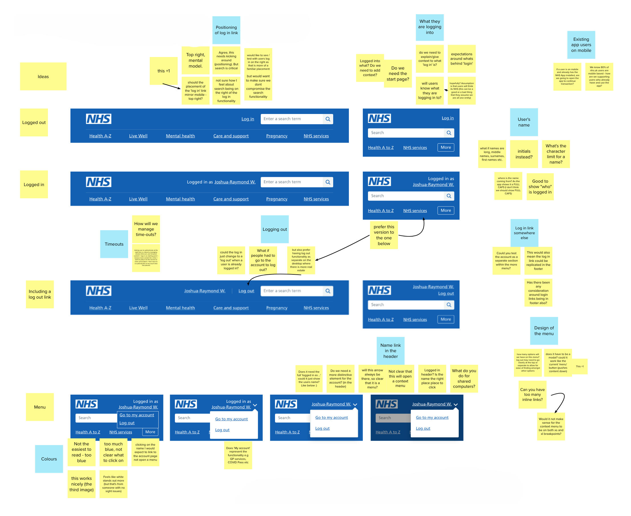
I facilitated an ideation workshop where existing pages on the website relating to online health transactions were reviewed and pain points and inconsistencies identified. I then moved the team into a sketching session to visualise proposed solutions before creating mock-ups of designs in Adobe Xd.
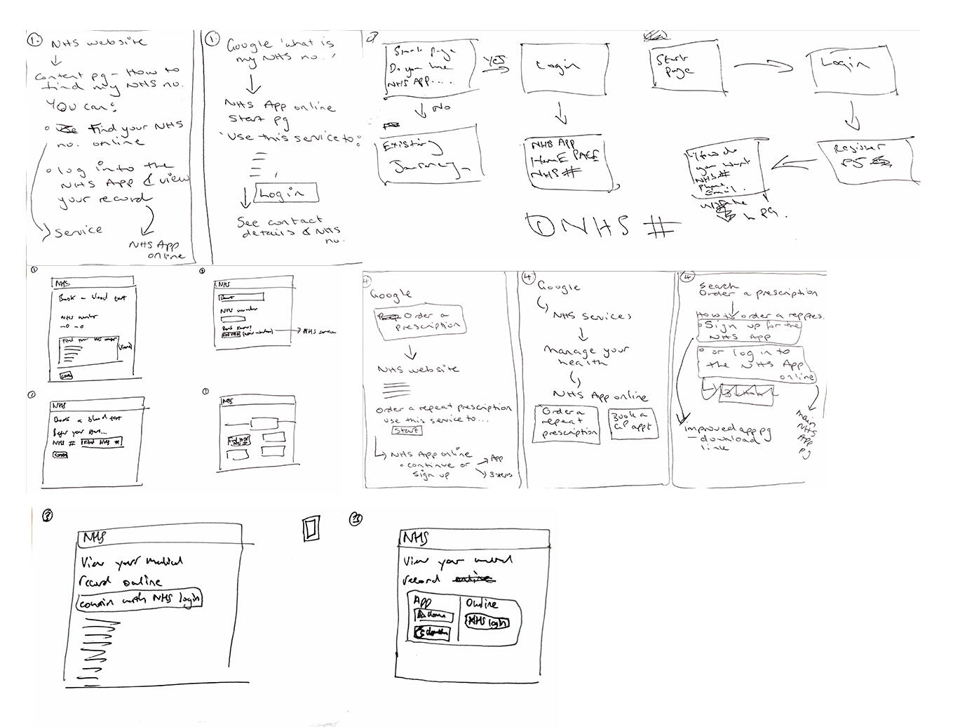
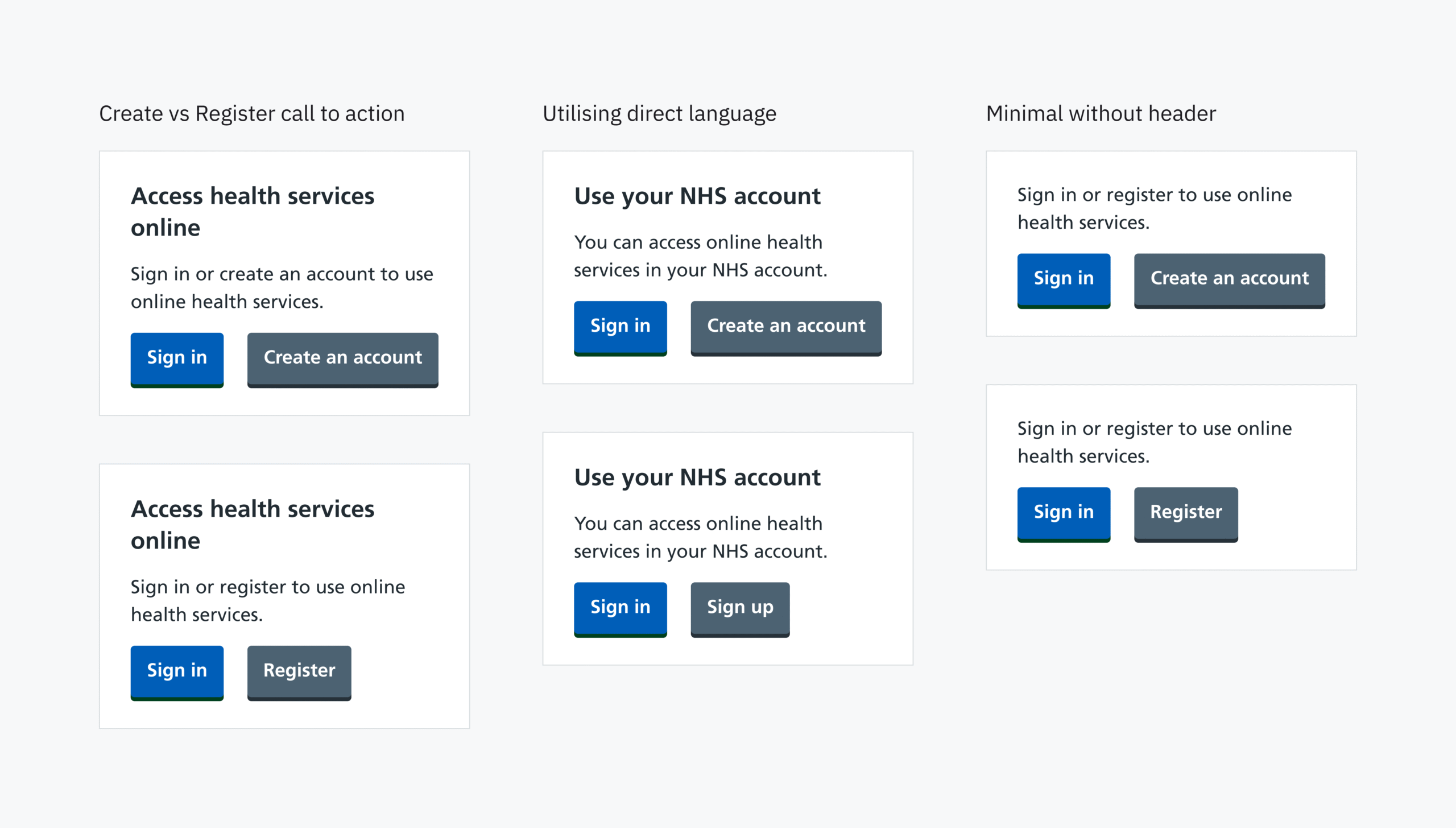
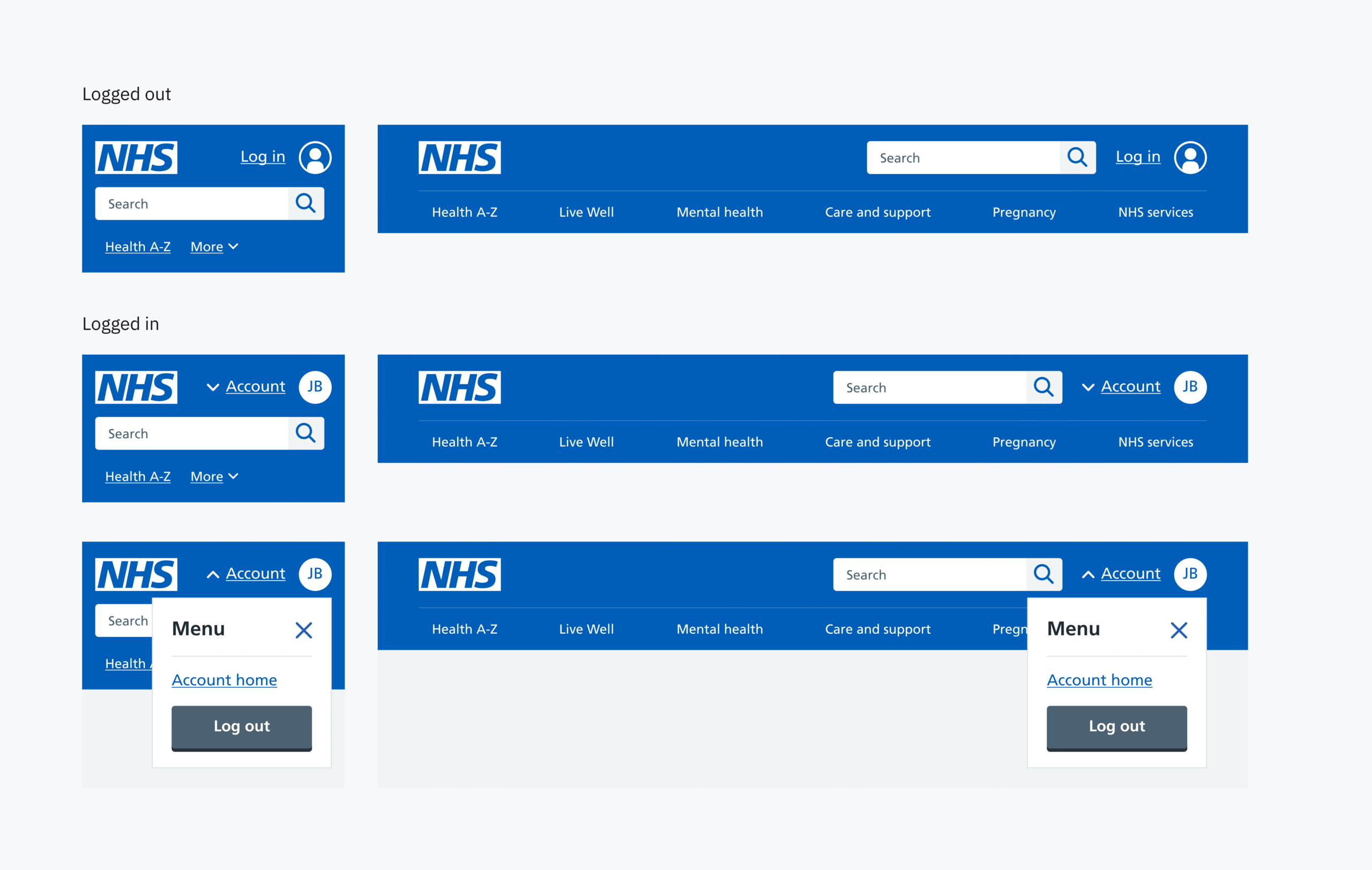
I used the outputs of the sketching session to create mock-ups of a new login component, which were shared with our stakeholders and further refined prior to usability testing.
Design critique
As well as regularly presenting progress meetings to stakeholders and commissioners, I also facilitated a co-design workshop with designers from different stakeholder teams. This allowed me to gain insight from designers on related programmes and projects and was invaluable in proving assumptions and understanding dependencies.
Testing and iterating
Utilising a HTML prototype, the team conducted six rounds of usability testing with a diverse range of participants. I contributed to the formulation of the discussion guide, conductued note-taking during the interviews and took part in a collaborative analysis session.
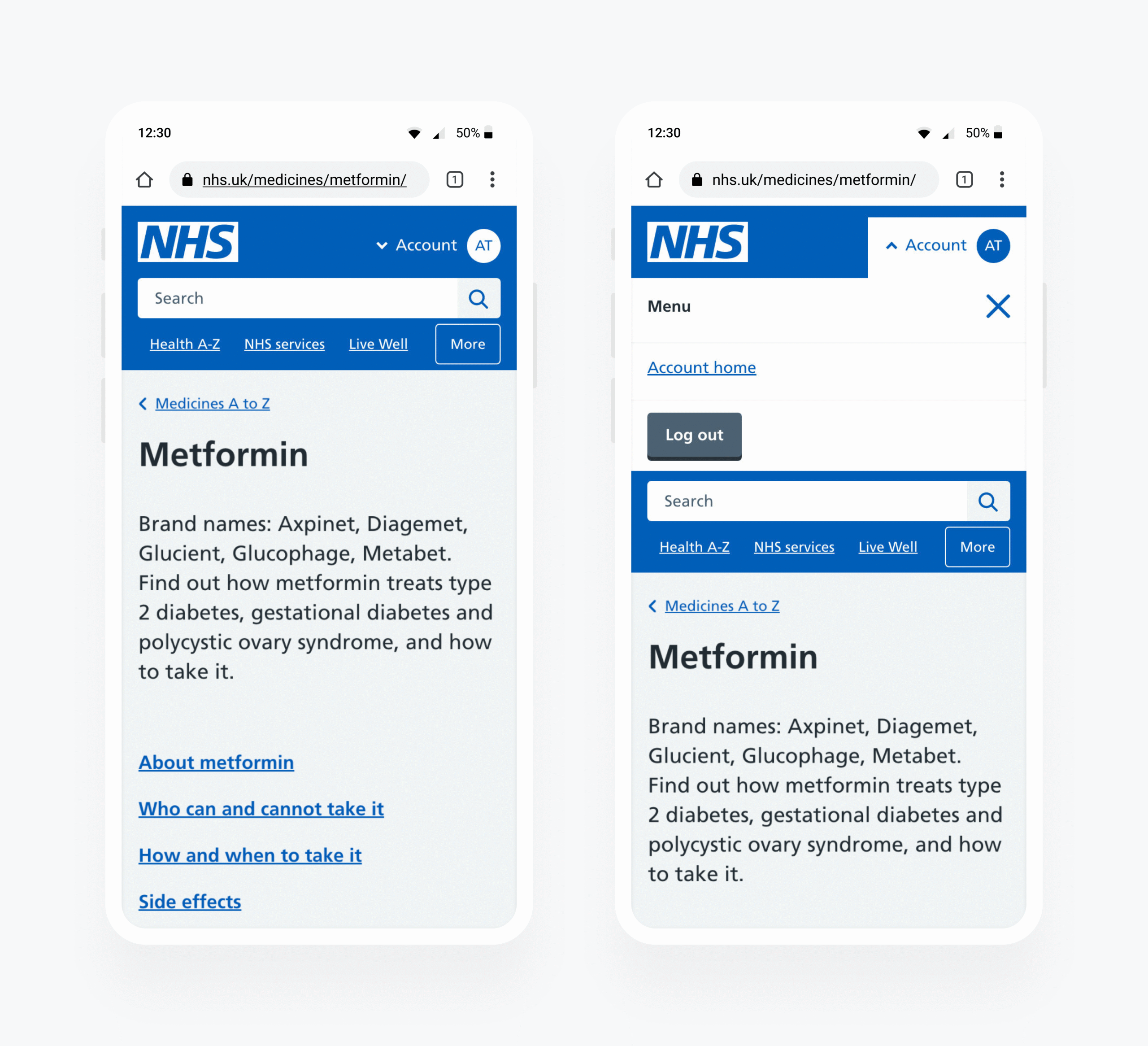
The insights from these sessions allowed me to iterate and refine the different elements of the design, which included a new component for users to log into their NHS account, and the addition of a new Account menu in the header of nhs.uk. We also tested extensive changes to content design, language and labelling throughout the journey.
Limitations
As initially designed, the account menu in the header would allow users to see their logged in status, access their account, and log out. Ultimately this feature was not released as part of the MVP, due to technical limitations.
Instead, a static My account link was released in the header. This solution met the need of improving access to access the account, and would enable the team to monitor conversion and then assess whether further enhancement should be prioritised.
Accessibility and inclusive research
To ensure the usability of our solution across user groups, we tested with:
- existing NHS App users
- people who had never used the app
- less digitally skilled and confident people
- people skeptical of digital services
Interviewing and understanding the specific concerns of these different groups ensured we created a solution which met the needs of the more marginalised citizens.

I carried out a complete accessibility audit of our prototype using a screen reader, in advance of usability testing with users who use assistive technology. This was vital in understanding how well blind and visually impaired users could navigate between the NHS website and the NHS account.
Outcome and impact
UI design elements included:
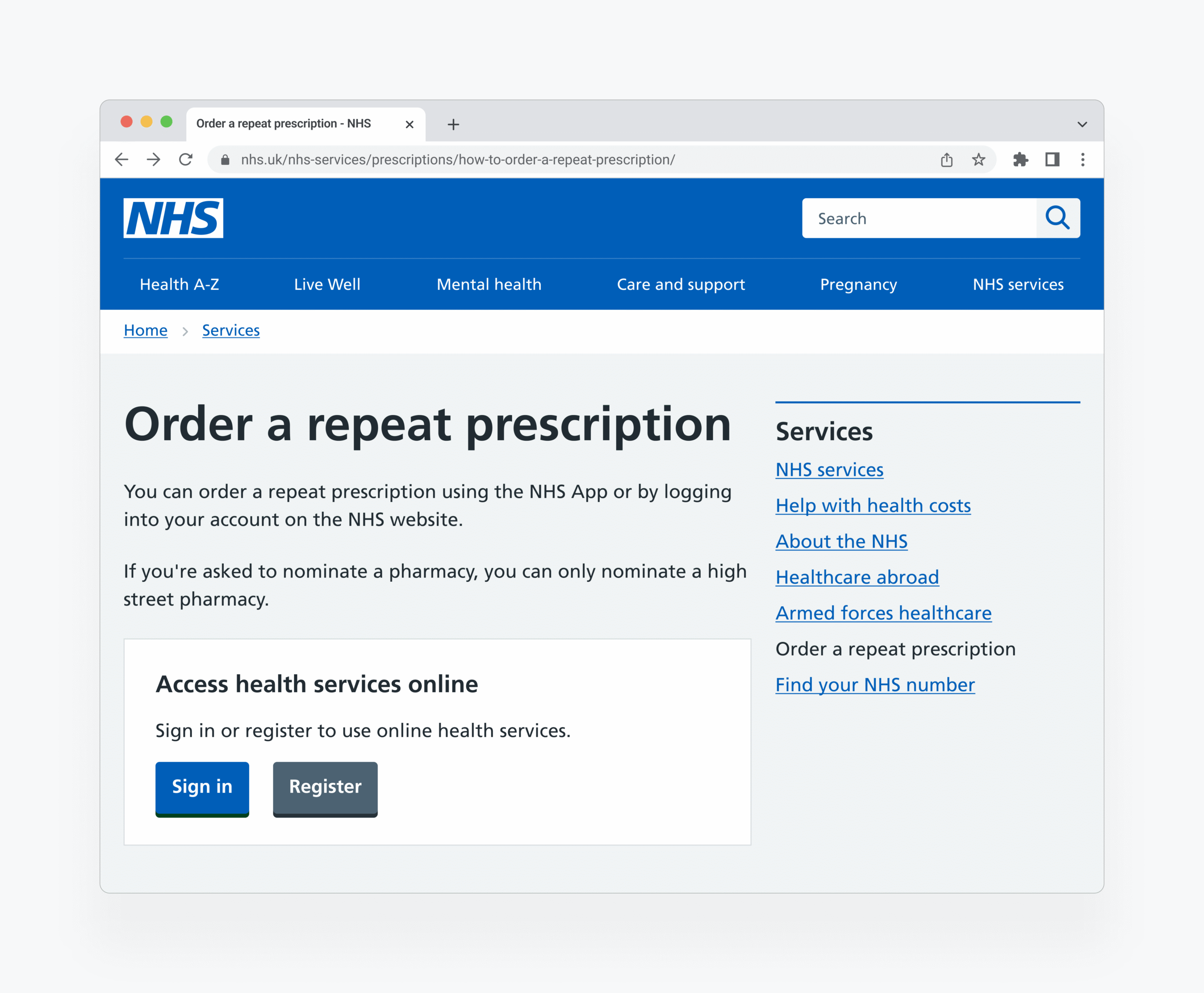
- A new component for the NHS website which allows users to log into their online account.
- A new link in the header of the NHS website so returning users can quickly access their account.
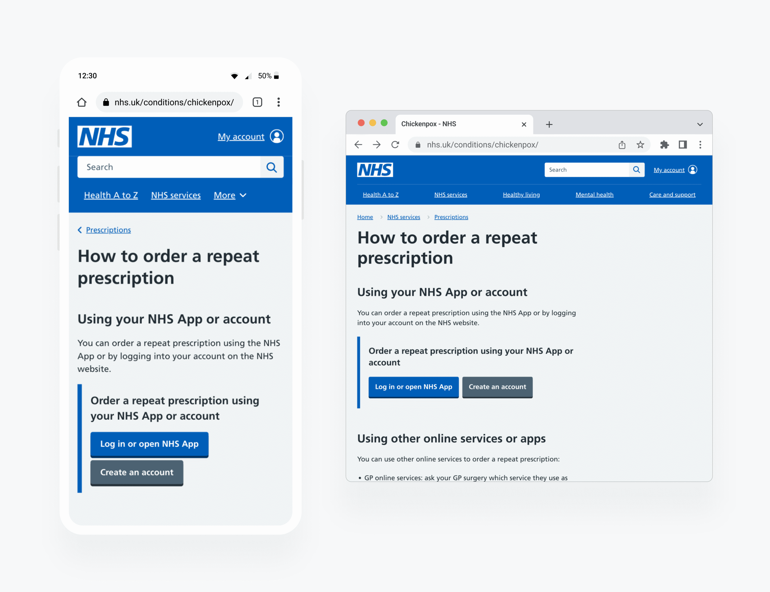
Content design and journey improvements made throughout the website and Account included:
- Extensive content design changes relating to the labels and language used around the NHS App and NHS account
- Creation of a new concept of the account being the destination and the NHS App or NHS websites acting as the client
Analytics showed an increase of browser-based traffic to the NHS account of 3% in the first four weeks since go-live. This represents 3 million clicks through to the account from the NHS website, demonstrating we have succeeded in giving users more choice in how they access online health services.
See the log in component on the NHS website
Continuous improvement
There are currently surveys live to enable the collection of quantitative data on the effectiveness of the initial release and allow insights to be gathered which will inform further design iteration of the product.
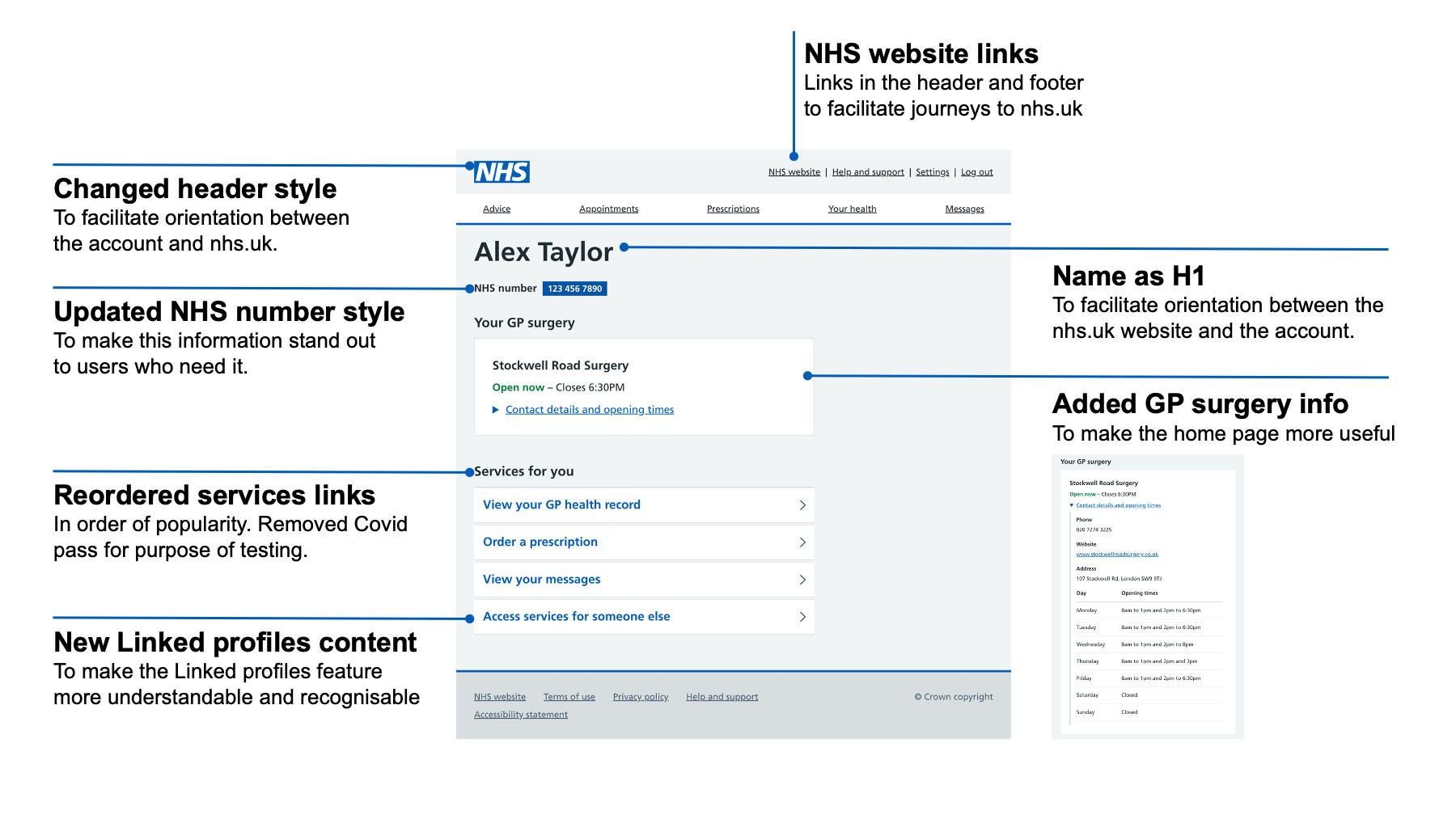
Following the initial release of these changes, we conducted further usability testing of designs (shown above) which improve the information architecture of the account destination and facilitate better user orientation between the NHS website and the NHS account.
