Objective
A strategic decision was made to run an on-platform test to offer a £10 reimbursement to increase sign-up, particularly among low-income and minority ethnic groups. I led the end-to-end design of a scalable, cost-effective reimbursement service that aligned with organisational diversity strategy.
My role
As Senior Product Designer, I shaped the participant experience to meet strategic inclusion objectives. I directed cross-functional collaboration with policy, finance, ethics, and inclusion teams, balancing usability, accessibility, and technical feasibility, and led design decisions that maximised inclusion and user confidence.
Design and ideation
I facilitated a kick-off workshop to align the product team and stakeholders on goals, timelines, and insights from a prior pilot. Using collaborative exercises, we generated “How Might We” statements to guide ideation, such as:
How might we avoid participants feeling pressured to donate the voucher back?
How might we ensure users are comfortable claiming their voucher?
How might we ensure those in the pilot claim before the deadline?
I then led ideation and sketching sessions to explore concepts that reduced friction and anxiety, prioritised clarity, low cognitive load, and inclusivity.
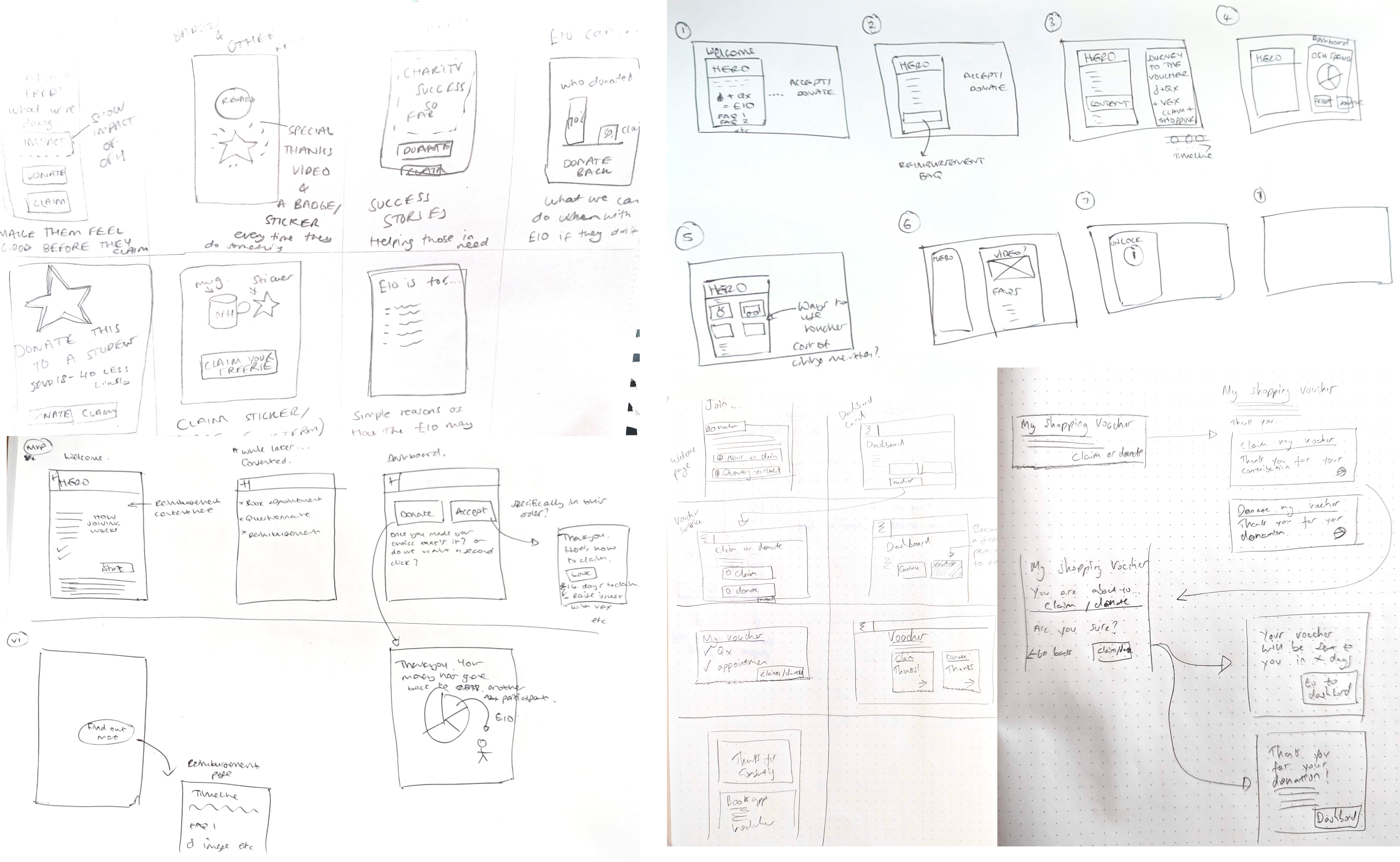
Integration with the existing journey
I mapped key touchpoints where voucher messaging could add value, leveraging insights on user behaviour throughout the participant journey, including the landing page, post-consent flow, and account dashboard.
Using these insights, I iterated high-fidelity mock-ups and wireframes, integrating design system components to ensure accessibility, consistency, and rapid implementation. Early designs were shared with the wider design team for critique, helping refine visual hierarchy and usability.
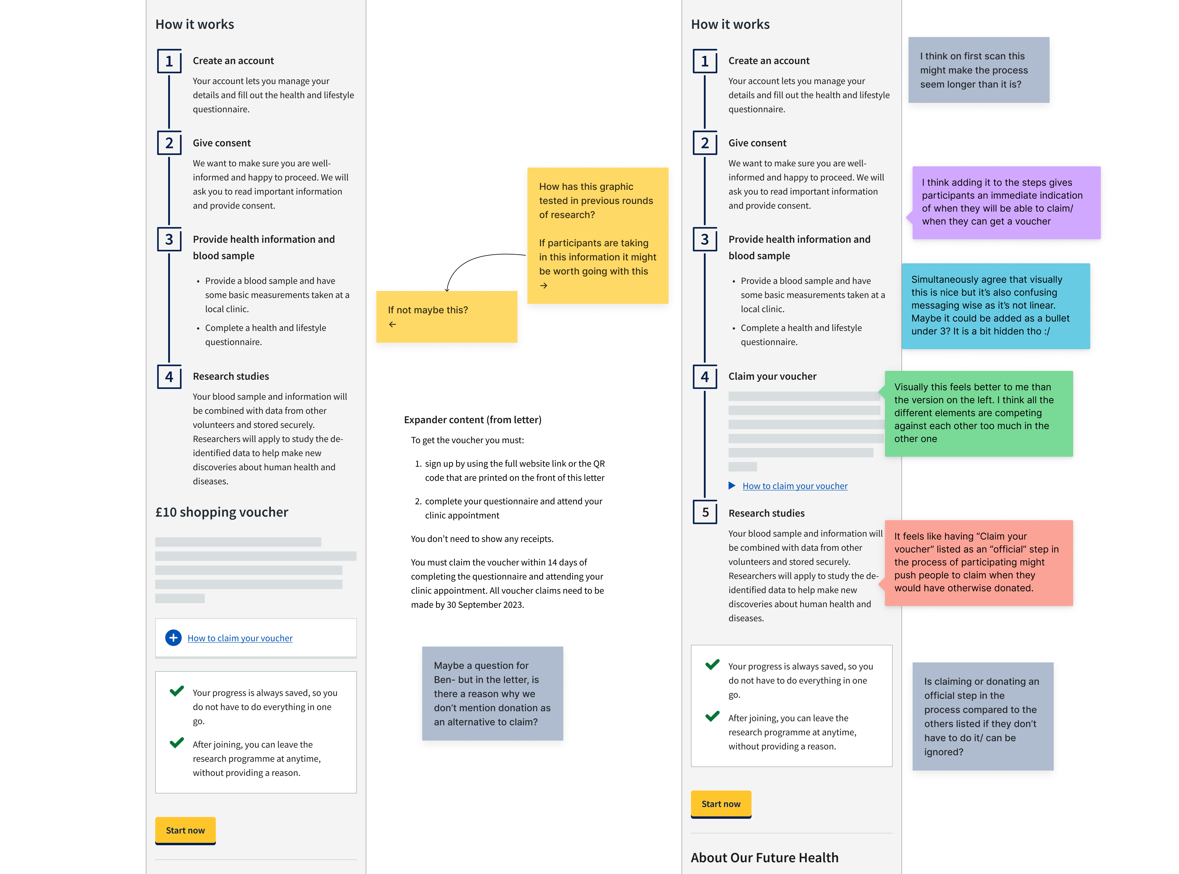
Throughout, I collaborated with cross-functional partners to balance user needs with organisational priorities:
- Communications – ensured brand messaging was clear and consistent.
- Behavioural science – optimised messaging and interaction to maximise uptake and minimise risk.
- Content design – crafted clear, actionable content for all user touchpoints.
- Ethics – ensured the experience complied with the Research Ethics Committee guidelines.
- Engineering – validated technical feasibility and smooth integration with the platform.
This approach ensured the final claim/donate journey was accessible, intuitive, and aligned with strategic diversity and inclusion goals, supporting high conversion and confidence among participants.
Designing the service to claim or donate the voucher
I designed a lend to end journey allowing a user to claim or donate a voucher, leveraging behavioural insights and design system components to reduce risk and create design consistency.
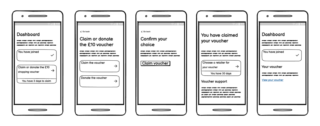
The journey utilised:
- One thing per page – to reduce cognitive load and follow best practice
- Decision confirmation – to allow users to recover from errors
- Sign-posting to the voucher partner, and setting expectations for support
- Voucher status, shown on the dashboard – to encourage participants to act and make them aware of the expiry date

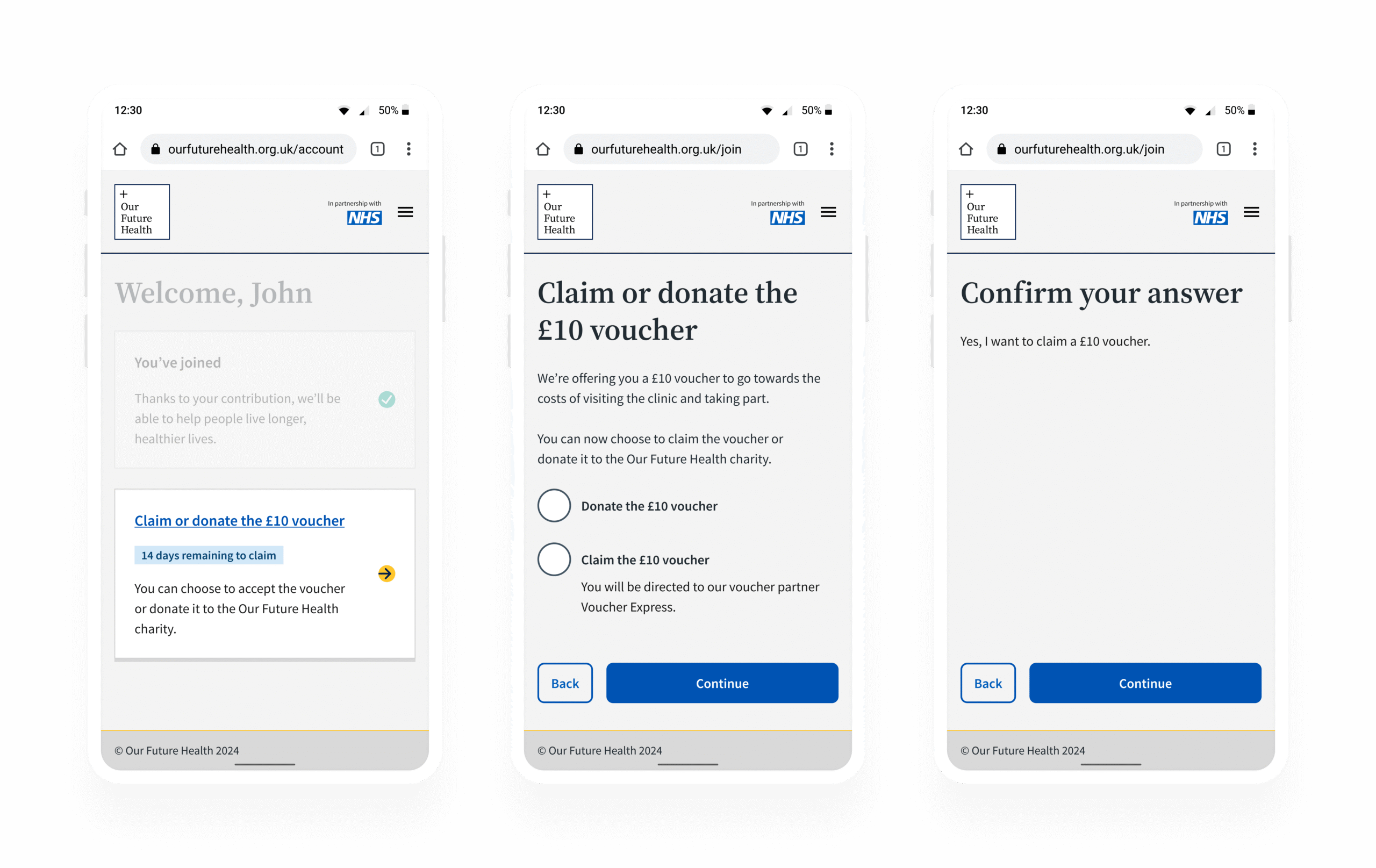
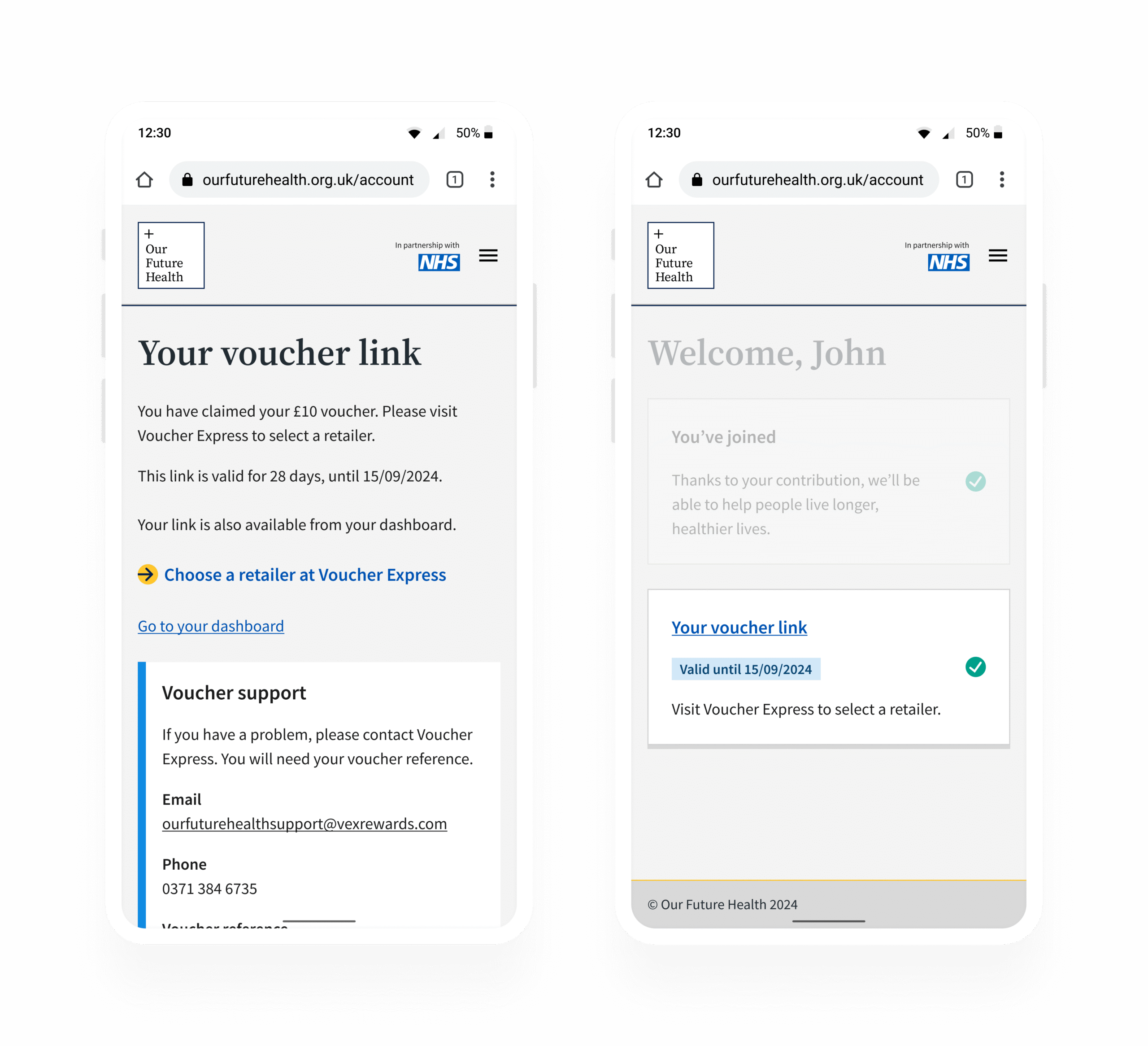
I utilised the design system at all points of the journey, enabling rapid prototyping and development, and ensuring accessibility.
On platform testing
My design was then utilised for a wide scale test to understand the impact and feasibility of introducing reimbursement.
Results indicated 24% more participants who registered for the programme and were offered reimbursement would go on to become full participants.
For the most deprived groups this increased to 27%, and increased by 19% for under-represented ethnic groups.
In order to leverage these significant increases in the likelihood of becoming a full participant the initiative was planned for rollout to all participants.
Actions
I facilitated a workshop to capture potential improvements to the journey before full rollout. Additionally, I collected insights from the study support team and mapped information needs for returning participants who had joined the programme before reimbursement was available.
This exercise helped the team to identify areas to explore in usability research and later A/B testing.
Usability testing
Usability testing was conducted on the end-to-end journey with the objective of gathering qualitative insight into the understanding of the voucher and the ability to claim or donate it. Findings included:
- Overall, there was a good level of comprehension on reimbursement content
- Some participants misunderstood the 14 day window to claim or donate
- Both the journeys to claim and donate the voucher had minimal pain points
- The most common question about the voucher was where can it be spent
- Overall respondents were agreeable to the concept of reimbursement
Iterations based on insights
- In the invitation letter, wording was amended to bring more clarity to the 14 day window in which to claim or donate
- On the landing page, further information was added on the option to donate the voucher
- On the participant dashboard, an expander was added with details about the initiative, for users return directly into their account
- Alongside the days remaining to claim, the date and time of the voucher expiry was added.
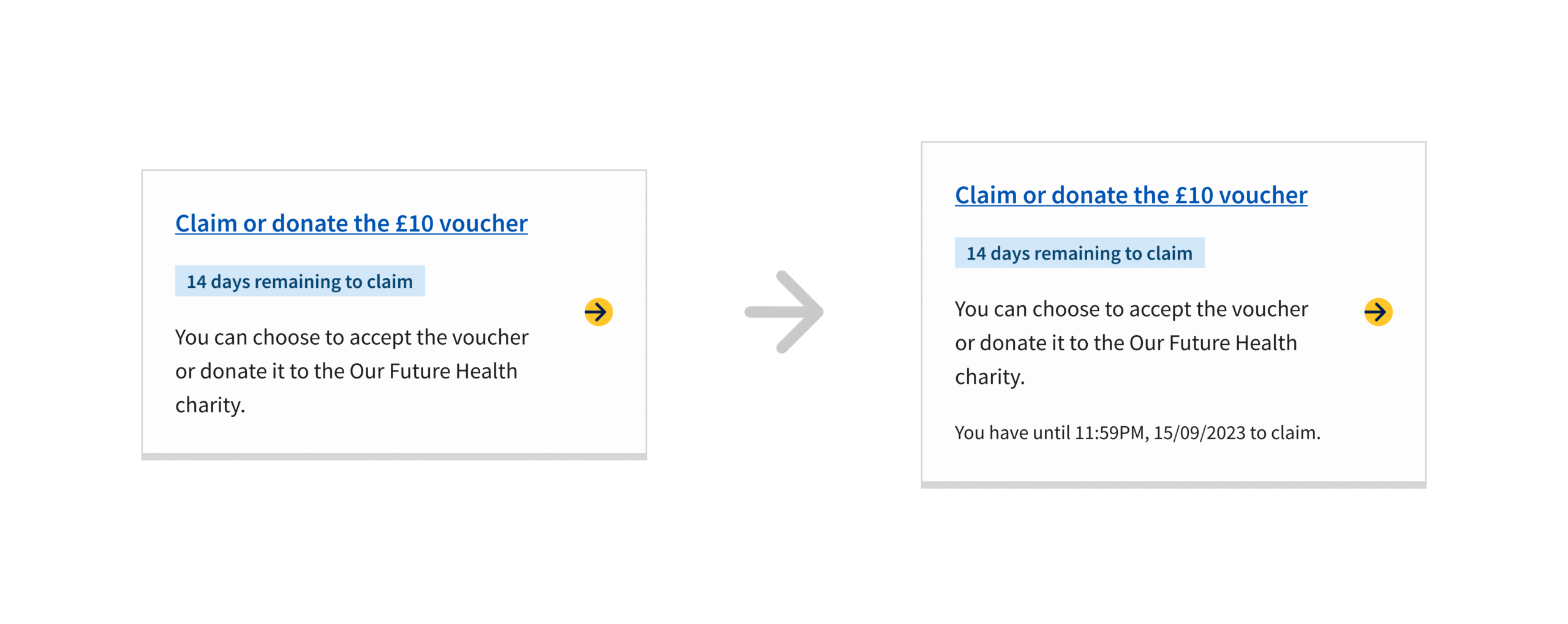
Outcome
The final solution increased participation among under-represented groups and supported organisational diversity targets.
To date the journey has facilitated over 420,000 reimbursement claims including over 90,000 active donations of the voucher back to the Our Future Health charity. The initiative is seen as a key element of the current success of the programme.
The journey to claim or donate the voucher also has a 96% conversion rate.
Continuous improvement
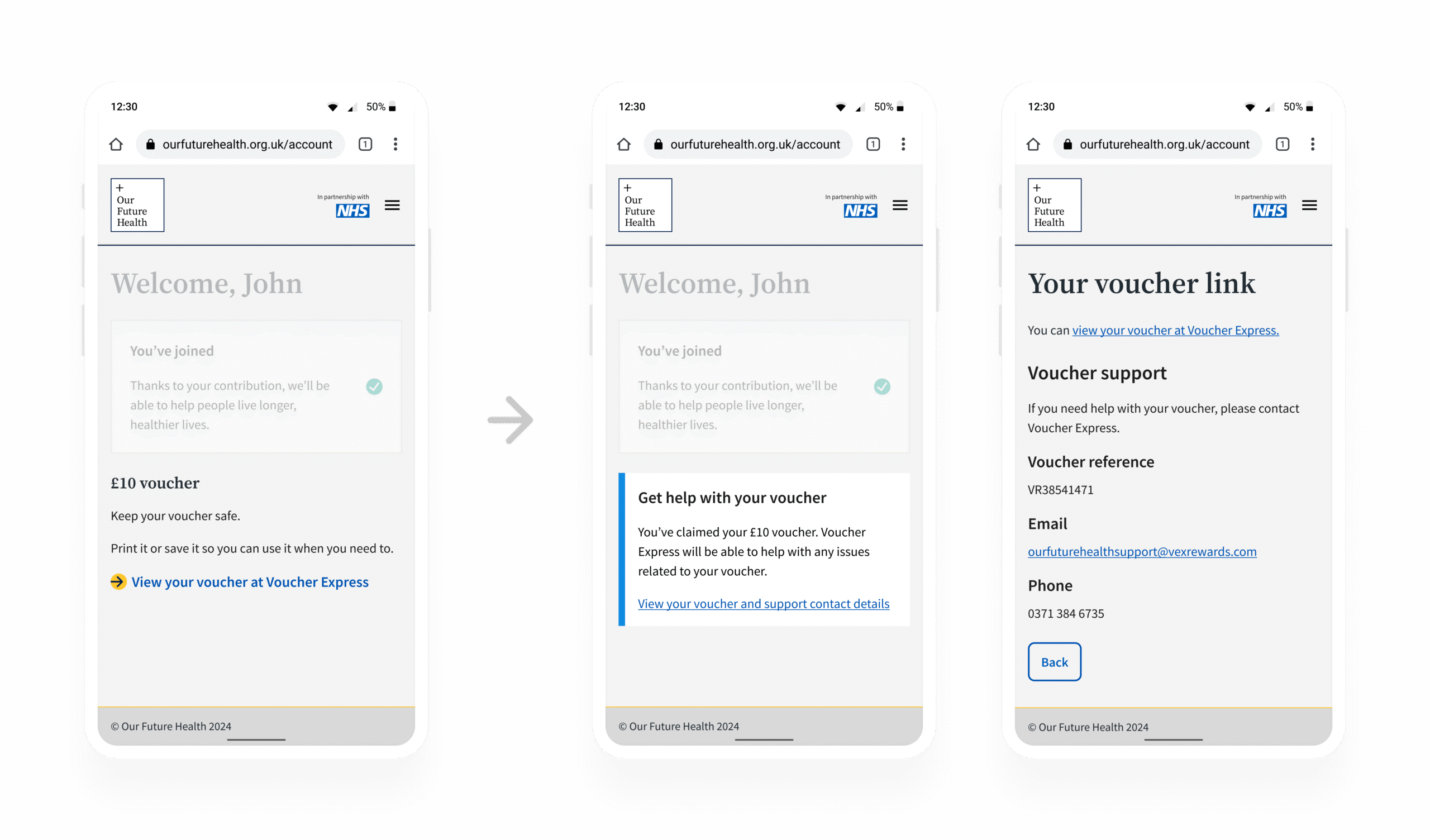
Noticing that returning participants lacked access voucher support details, I co-designed a self-service solution with the content designer, reducing support requests by 99% and improving participant experience.
Reflection
This project reinforced my ability to lead complex, multi-stakeholder initiatives while keeping inclusion central. By validating solutions through on platform testing, usability testing and iterative design, I delivered a scalable service that significantly advanced Our Future Health’s mission to become the UK’s largest and most diverse research programme, supporting inclusive research and scientific impact.
