Problem
- 10 percentage point drop-off on the longest page of the registration experience
- Existing design elements did not accurately set expectations or align with the design system
- Quantitive evidence that participant understanding of the research programme could be improved
My role
Senior Product Designer. I owned the UX optimisation of the core registration funnel. By applying behavioural design principles and leading iterative A/B testing, I achieved a 3.01% increase in consent rates, scaling the UK’s largest health research programme by over 7,500 participants per month.
Discovery
Analytics
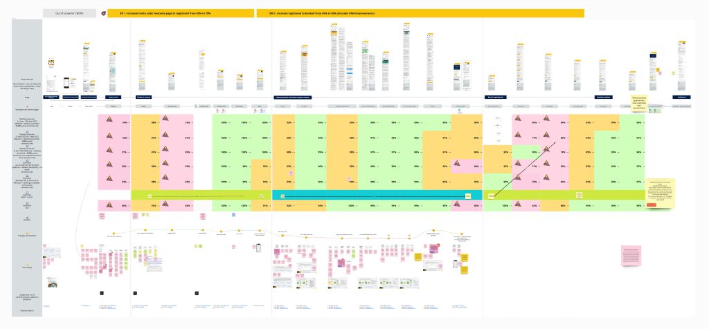
Analytics showed higher conversion across all pages except one, where dwell time was too short to read the information. A detailed journey map identified drop-off points and opportunities to improve expectations.
Usability interviews
I contributed to the discussion guide, carried out note-taking for all 12 interviews, and assisted with planning the structure of the collaborative analysis workshop, as well as contributing design insight.
Interviews revealed users struggled with long information pages, unclear expectations, and lack of orientation in the journey.
Example user need

As someone who has decided to join the research programme, I need clear expectations of what the sign-up journey involves, so I can set aside enough time to do it and I don’t have any surprises.
Example hypothesis
We believe that an increase in the number of users who sign up for the programme can be achieved if potential participants have clear expectations of what the sign-up process involves.
Design and ideation
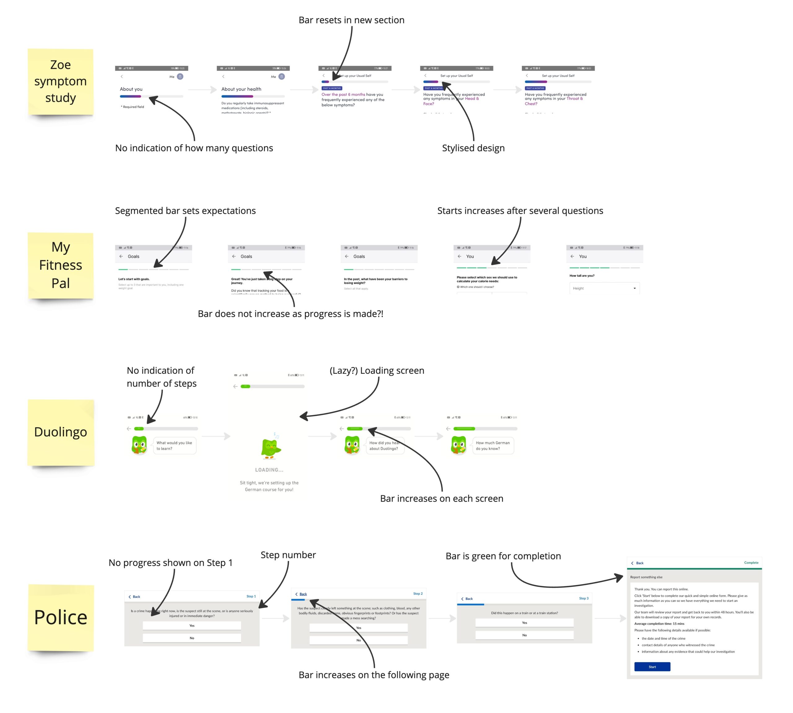
Competitor analysis
I reviewed other progress indicators to understand user expectations and identify effective patterns. This highlighted the unique challenge of our journey: a single, exceptionally long page requiring clear time and effort expectations.
How might we improve wayfinding and orientation for users joining the programme?
How might we better visualise progress through the five pages of participant information to set expectations and encourage completion?
Early Wireframes and Critique
Initial solutions included variations of progress bars, page indicators, and visual feedback. These were shared in design critiques with the wider design team to evaluate feasibility, accessibility, and alignment with the design system. Feedback helped refine ideas before the first round of usability testing.
Design and iteration
Round one
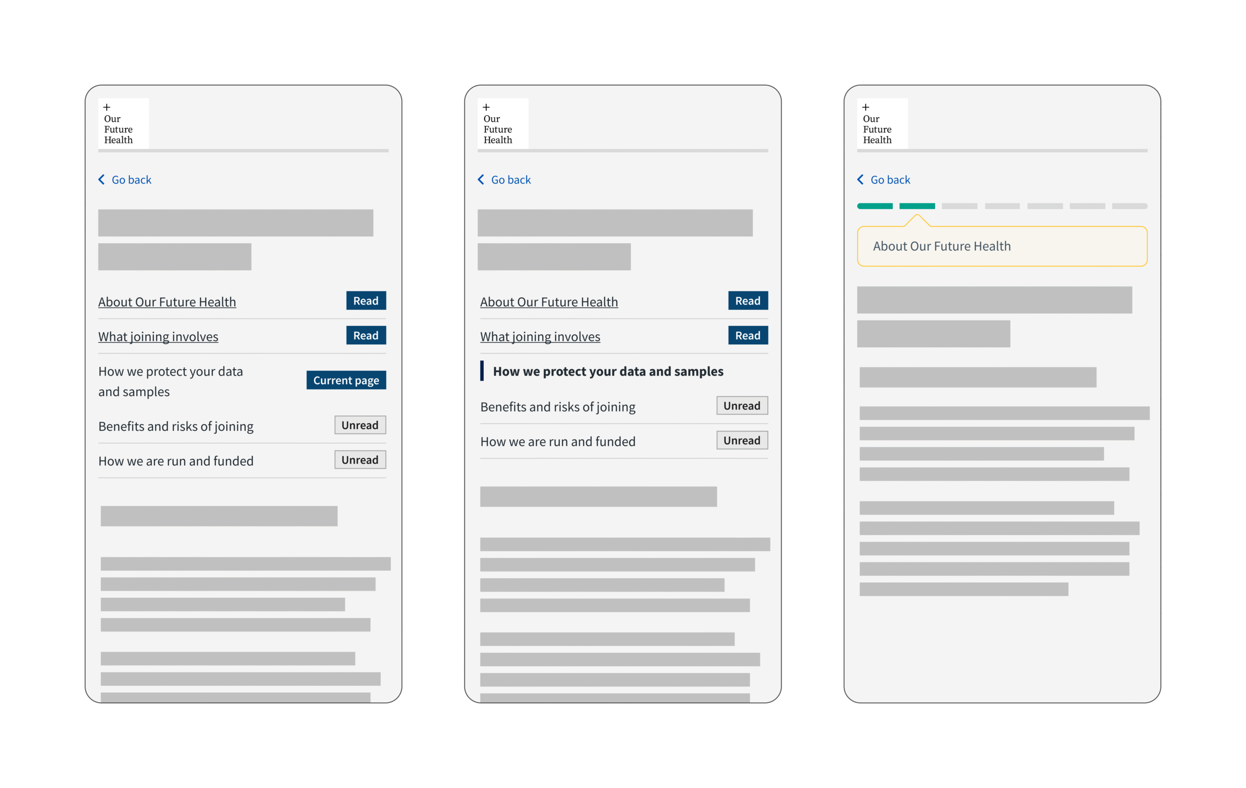
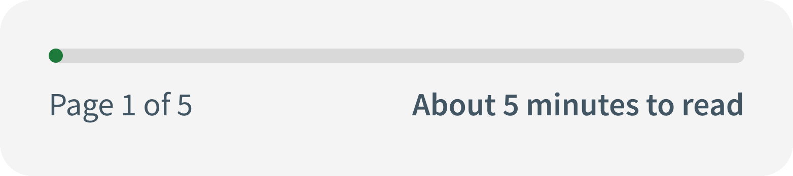
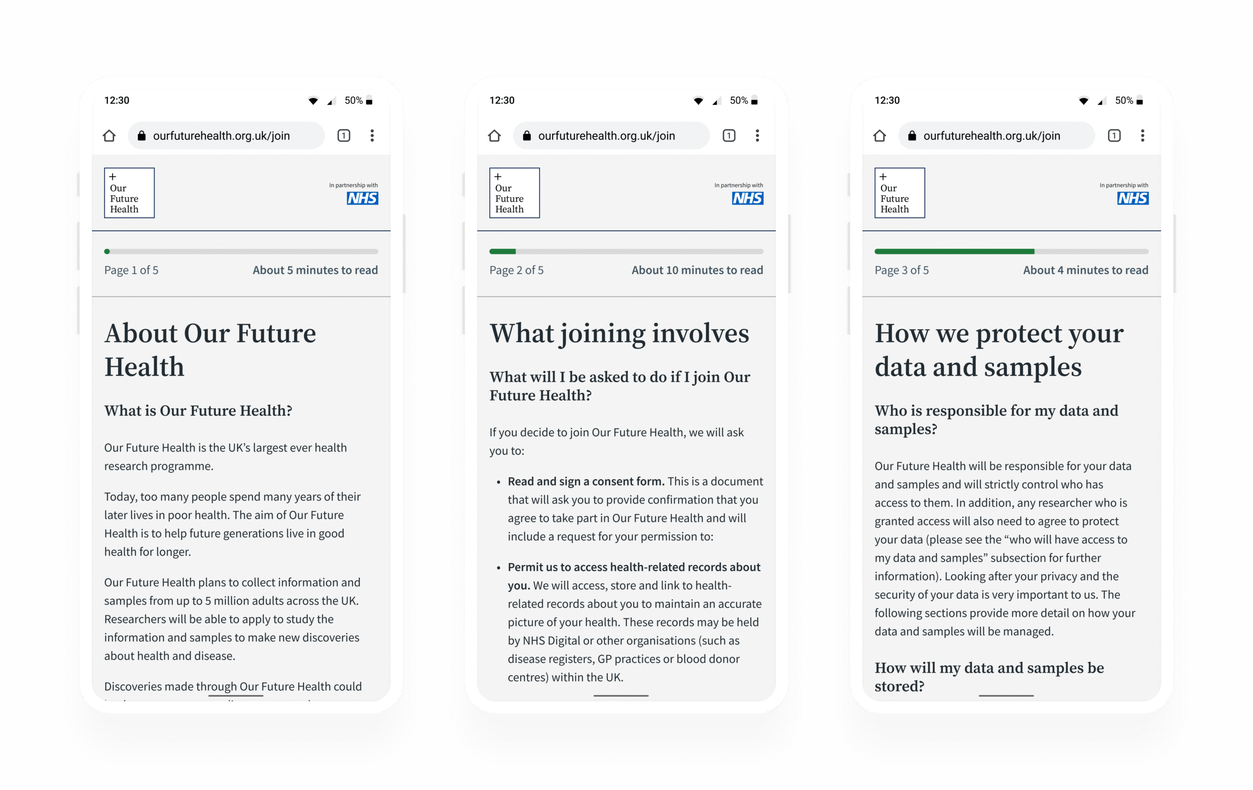
Early wireframes explored ways to visualise progress, including a single progress bar that increased proportionally to page length, animated transitions for delight, page numbering, and estimated reading time.
Insights
- Users appreciated seeing progress but were confused by estimated reading time.
- Some users misunderstood whether time was per page or for the entire journey.
- The progress bar itself was understood, but required prompting to notice its value.
Changes made
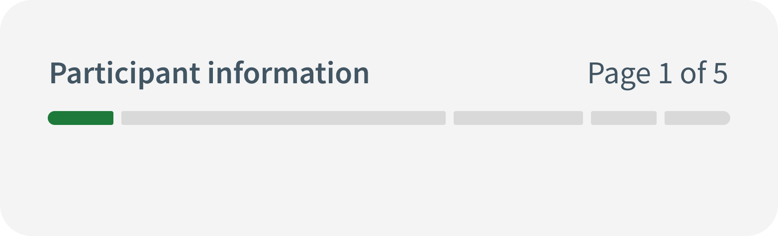
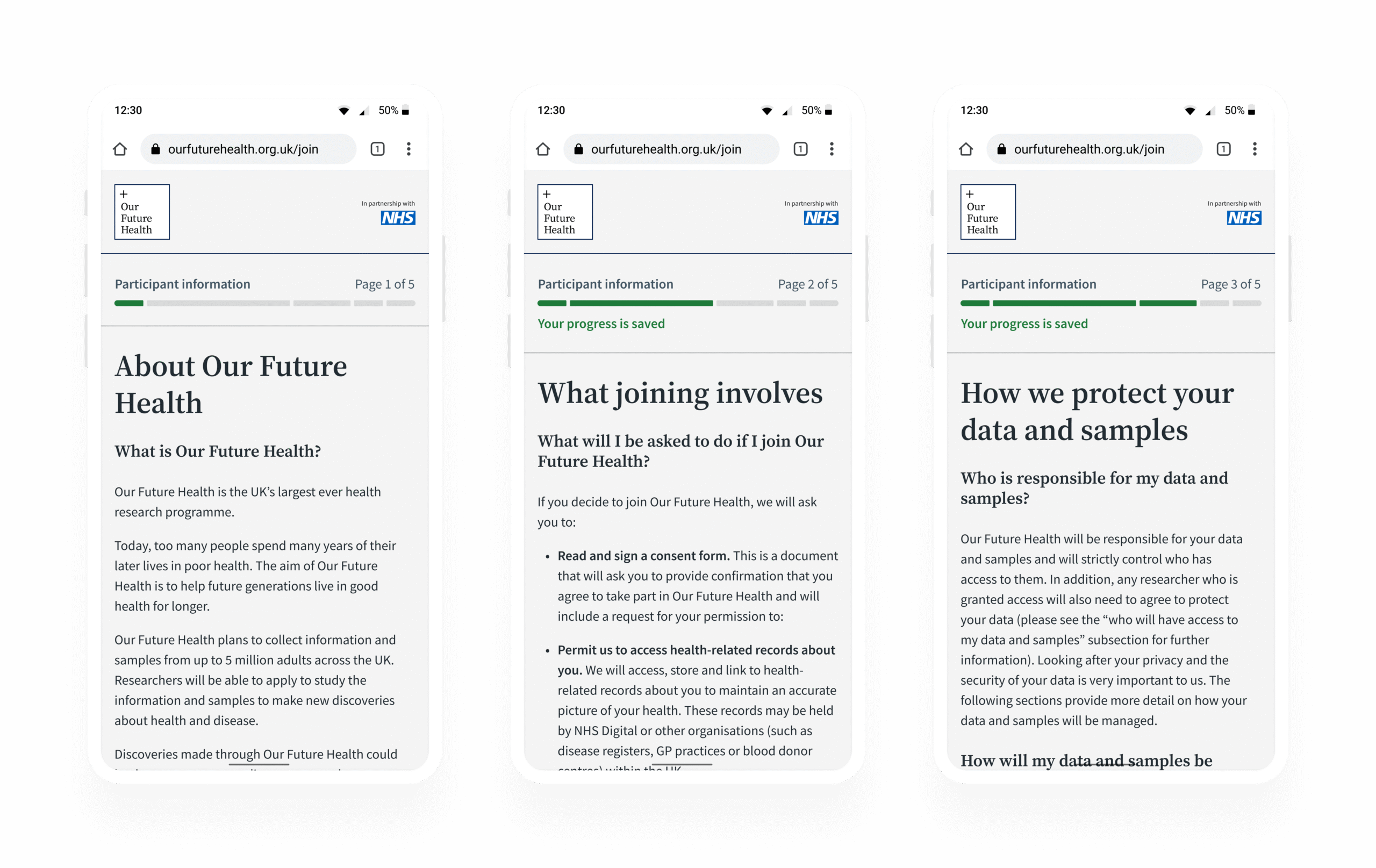
- Replaced estimated reading time with visual bars proportionate to each page length.
- Added “Your progress is saved” for reassurance.
- Marked pages as completed on load to motivate continuation.
- Included participant information at the top of each page for orientation.
Round two
The updated design reduced frustration and clarified expectations. Users better understood their location in the journey, even if they didn’t consciously reference the progress bar.
User testing outcome
The design which was successful in round two would be AB tested on the production site. I created high-fidelity development ready files in Figma, ensuring interaction and accessibility were documented. I also collaborated with engineering to ensure the final build met the specification of the design file.
Stakeholder engagement
Given that this part of the journey is owned by the Ethics team, I provided them with visibility into the design proposals, the success of the usability testing, and the hypothesis for AB testing.
Accessibility
When navigating with a screen reader, the percentage of progress is announced, this allows screen reader users to take advantage of the feature. The feature was tested as part of a regular accessibility audit and no concerns were raised.
A/B testing
The successful design from round two was handed to engineering for A/B testing. The experiment yielded a 2.27 percentage point conversion increase and a 3.01 percentage point increase in overall consent rate, equivalent to 7,500+ additional participants per month.
Outcome
The progress bar variant was deployed to 100% of traffic and significantly increased conversion rates in line with the impact of the A/B test.
The new journey improved visibility of participant progress and reduced drop-off rates. The work also influenced the wider product priorities as the feature was considered for implementation in other parts of the journey.
Reflection
This project strengthened my ability to lead multidisciplinary teams to align data collection with clear, human-centred design. It demonstrated how even minor design interventions can have a positive impact on conversion rates.