Due to confidentiality, this case study omits internal data and designs. Screens and artefacts have been recreated for illustrative purposes.
The challenge
Many customers who make payments, whether to new or existing payees, experience anxiety about sending money to the wrong person. This can lead to payments in error, a poor customer experience, and costly support cases for the bank.
Our goal was to reduce these errors by improving the customer experience while maintaining the simplicity of the payment journey.
My role
I led UX and visual designer in a multi-disciplinary product team. I facilitated alignment workshops between product owners and platform architects to ensure robust UX within the constraints of a major technical modernisation.
My responsibilities included:
- Discovery activities (journey mapping, heuristic analysis, stakeholder workshops)
- Wireframing and prototyping of concepts
- Hypothesis generation and ideation sessions
- Prioritisation and design iteration based on impact and barriers
- Defining behavioural metrics to monitor success
I also collaborated with the content designer, design researcher and product team to refine concepts for feasibility and impact.
Discovery
To understand the nature and impact of payment errors, we combined analytics, support cases, and frontline insights from operations. Together we created a baseline of how many payments in error occurred and what they cost to resolve.
This process revealed that vulnerable customers were disproportionately affected, often taking longer to recover financially after a payment to the wrong person which could not be recovered.
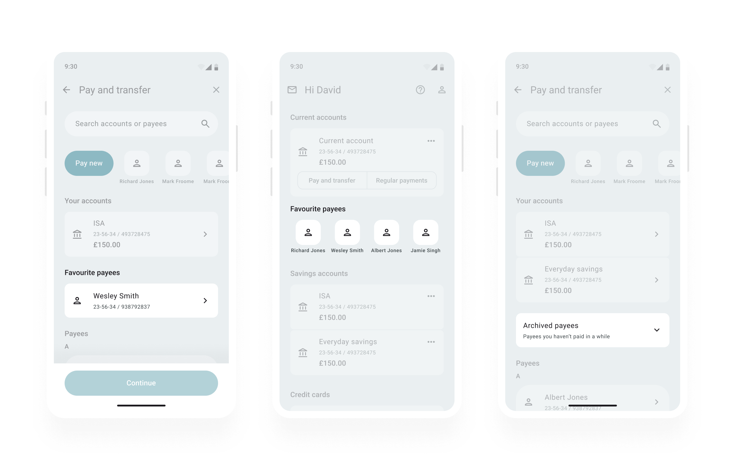
I also conducted a heuristic analysis of the current experience to identify usability issues and created a comprehensive journey map covering Android and iOS. This artefact combined customer insight, stakeholder relationships, analytics, and identified opportunities into one view of the end-to-end experience.
From unmoderated exploratory research, we learned:
- Customers feel most anxious when paying someone new.
- “Making a mistake” is a recurring worry.
- Trust in the confirmation of payee check (where payee name is checked against the account details) is high.
- Customers often send small “test payments” to confirm details.
- They expect their bank to provide helpful, proactive cues.
Example user needs

As someone paying someone I’ve paid before, I need visibility of my past interactions with a payee so I can avoid paying them twice by mistake.
As someone making a payment, I need my bank to make the process simple while keeping my money safe, so I can complete my goal without stress.

As someone making a payment, I need reassurance that I’m paying the right person, so I feel confident transferring money.
Framing hypotheses
I facilitated a cross-team hypothesis generation workshop using defined problem statements and user needs. Involving colleagues from the operations support team ensured frontline insights were embedded from the start of ideation.
I focused on framing our final three hypotheses as directions rather than solutions, emphasising that these would form the foundation of our upcoming ideation session.
Example hypotheses
We believe that by creating the right balance between confidence and speed, customers making payments will complete them with fewer errors, because they want ease and reassurance their money is secure.
We believe that by offering timely information and support, customers paying someone for the first time will feel more confident, because they are willing to accept some friction in exchange for reassurance.
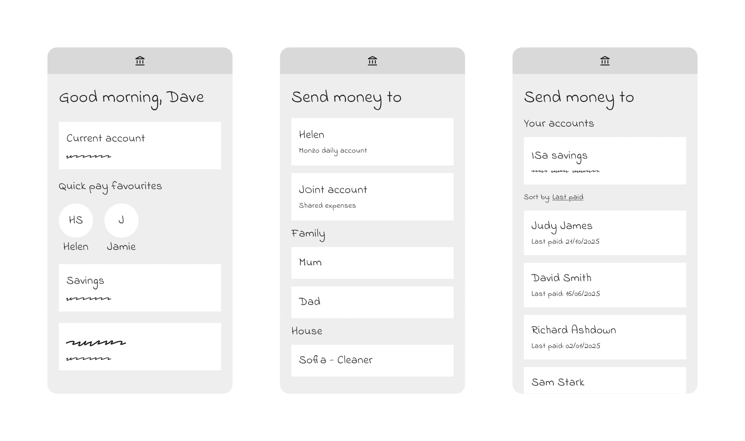
Ideation and concept development
I facilitated ideation sessions for each hypothesis, including “worst possible idea” warm-ups to spark creativity. We generated over ten potential concepts, ranging from favourite payees and grouping options to contextual nudges and enhanced payee information.
I then produced low-fidelity wireframes of all concepts for feasibility discussions with engineering and impact assessment with the UX and product teams.
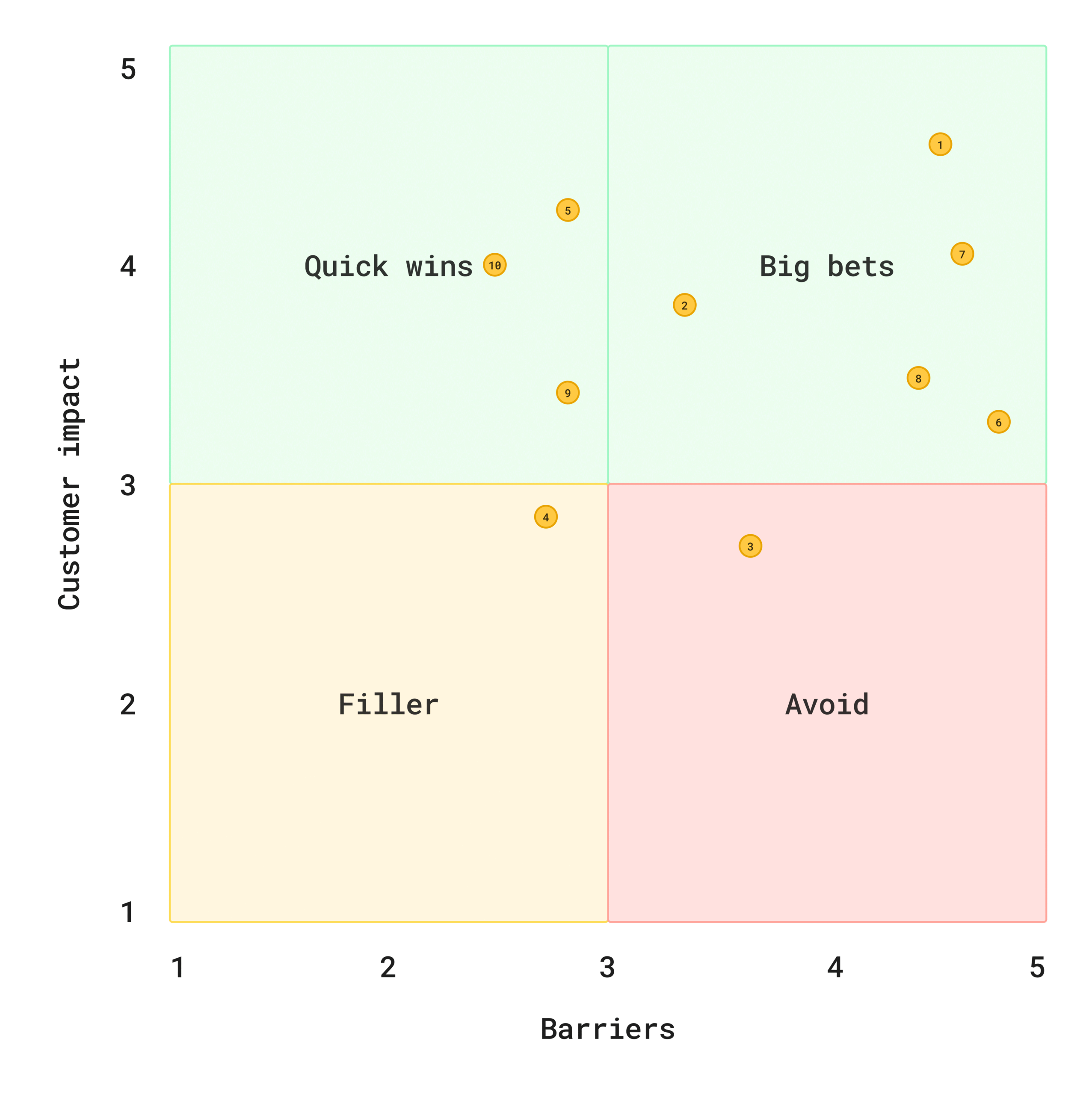
Prioritisation
To prioritise effectively, I facilitated an impact–effort matrix workshop with platform architects, engineers, and product stakeholders, scoring each idea by feasibility, effort, and customer impact. While many concepts depended on the bank’s wider technical transformation, the exercise aligned the team on constraints and helped the product team reframe priorities strategically.
Early concept testing
I created high-fidelity, interactive prototypes in Figma of all 10 feasible concepts, using the existing design system. This ensured familiarity to participants during research, and the opportunity to explore how wireframes would translate into a functional UI.
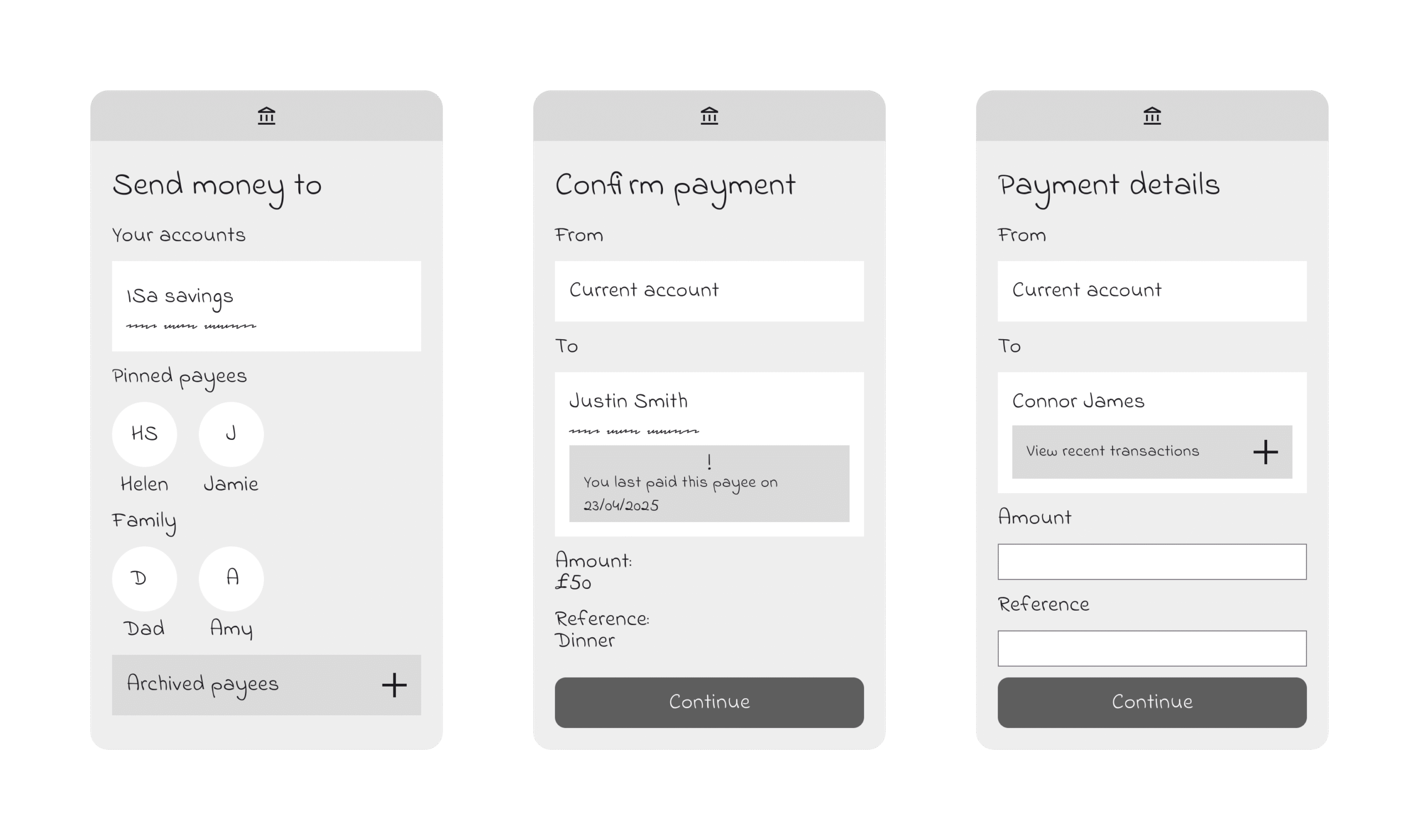
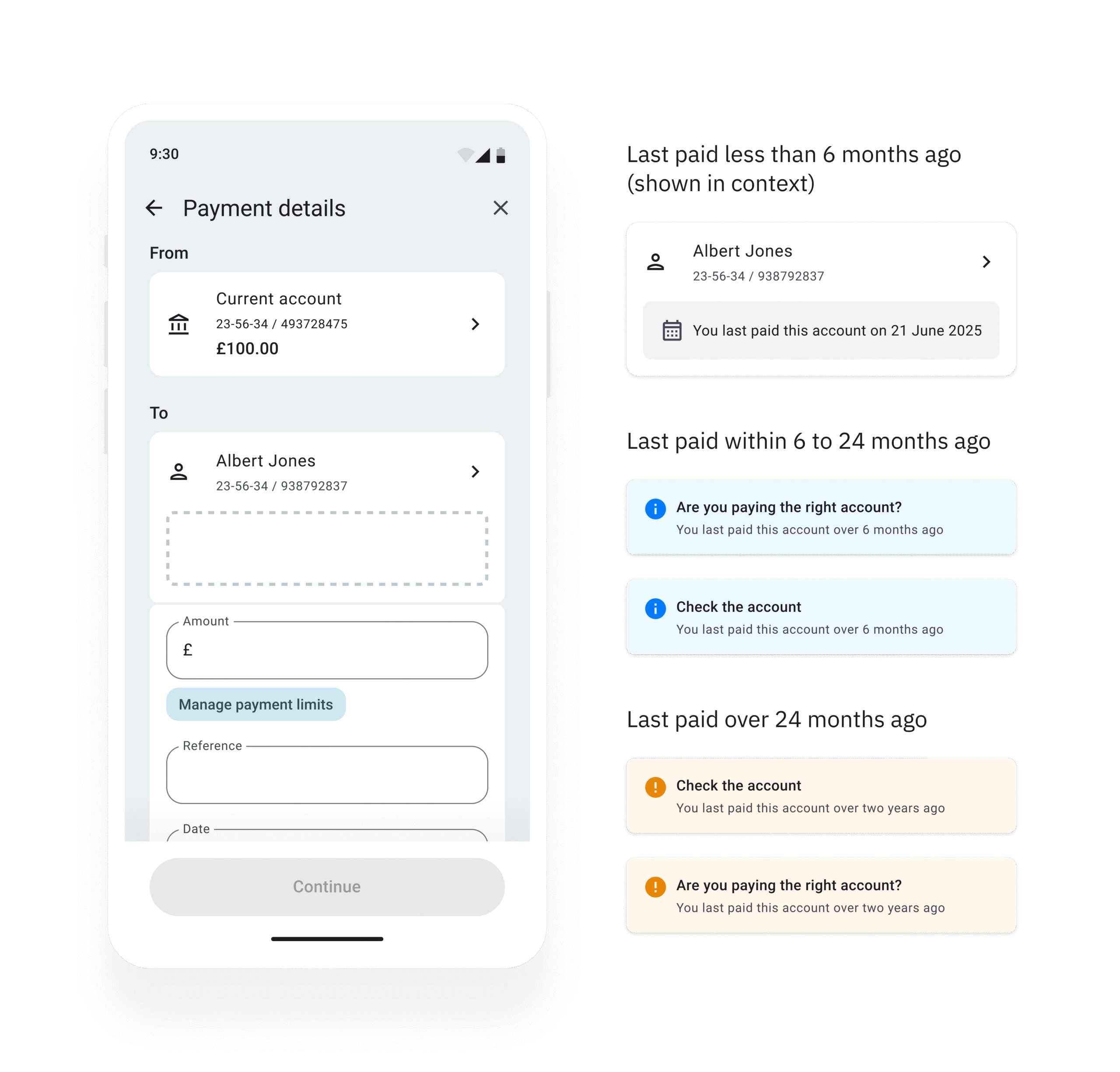
Moderated usability testing revealed that customers strongly valued seeing contextual nudges during the journey, such as the date a payee was last paid and having more control over how they manage their payee list.
Participant quotes included:
“Paying someone twice is easily done, this would really help.”
“If I saw this message, I’d immediately check I’ve picked the right account.”
Key learnings from round one testing:
- Friction is acceptable if it’s relevant and reassuring.
- Customers want control, no automatic payee management.
- Clarity and familiarity must be balanced with helpfulness.
- The broader experience, not just payee management, shapes trust.
Since the date last paid data was already available through an existing API and prioritised as a feasible concept, this became our most feasible path to early impact.
Round two testing
Building on the initial test results, I worked with the design researcher and content designer to iterate both the designs and messaging. We explored different ways to surface the date last paid information, providing the right nudge or message at the right point in the journey.
High-level feedback showed that:
- Showing the “last paid” date on the payment details page felt most relevant over the payee list
- Nudge messaging using notification components were more easily noticed than the less noticeable grey hint, which was sometimes missed
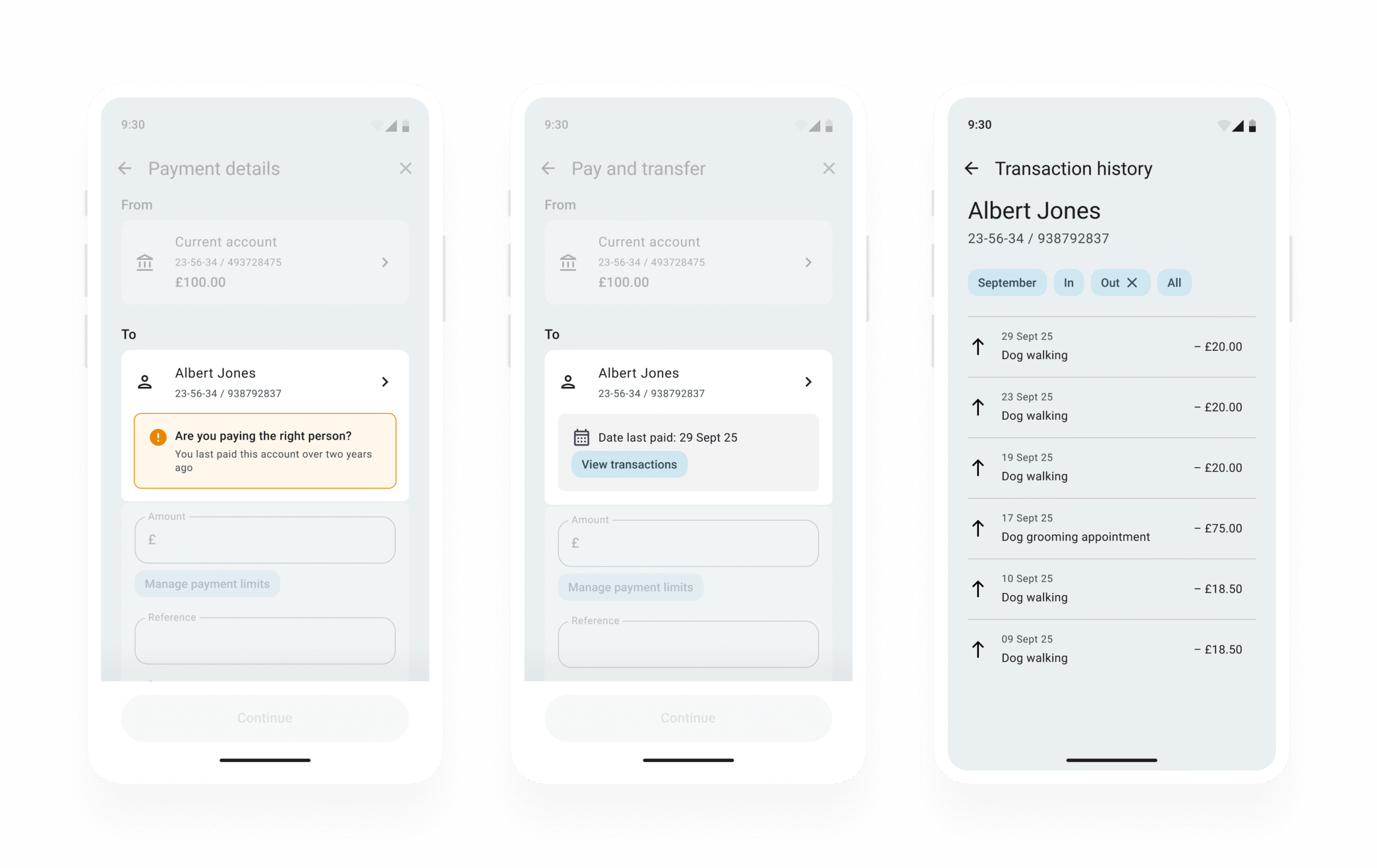
- The calendar icon led customers to incorrectly believe the message only related to a standing order
- Context was critical so customers knew what action to take
I then iterated the design based on feedback, including refining how and when the nudge appeared, ensuring it felt timely and supportive rather than intrusive.
Once the iterated designs were complete, I presented multiple options and a trade-off analysis to the product team. The team prioritised the concept judged to bring the greatest customer value.
Accessibility
I designed the solution with a focus on cognitive accessibility, specifically avoiding red to reduce user anxiety and utilising icons to support neurodivergent processing. These strategic choices were validated by an external consultant as exceeding WCAG 2.2 standards, ensuring the ‘confidence-led’ experience was inclusive for all users, including those using screen readers.
Delivery
Defining performance metrics
Building on the discovery baseline which quantified both the financial impact of payment errors and their greater effect on vulnerable customers, I worked with product and research colleagues to shape a shared measurement framework for success.
We focused on metrics that linked user confidence to business outcomes, including:
- Navigation behaviour – to see whether more customers reviewed or edited payee details before confirming payments.
- Error reduction trends – tracking accidental repeat or incorrect payments alongside support case volumes.
This approach helped shift the team’s thinking from isolated UI improvements to measurable behavioural change.
Final iteration
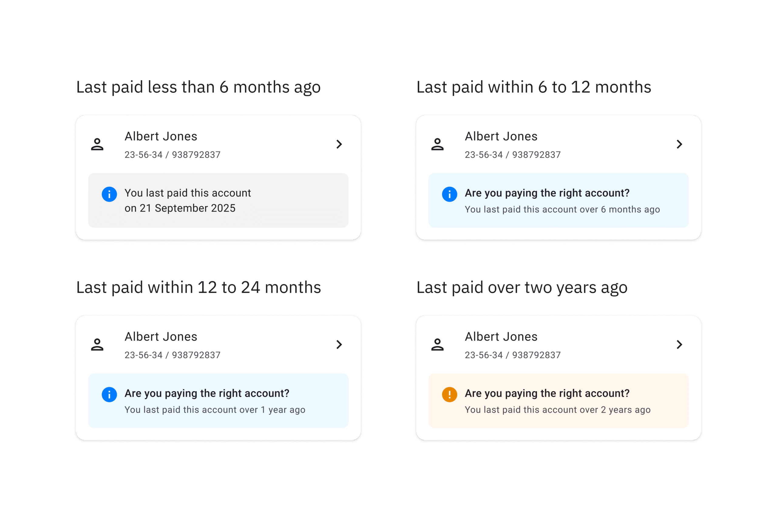
A final round of unmoderated testing confirmed that:
- The purpose of the dynamic nudges was clear, and participants understood how they could be beneficial.
- The increasing sentiment across different levels of nudge urgency was well understood and felt appropriate.
- There was a mix of preferences between showing the exact date last paid versus the time elapsed since payment. This will be monitored post-launch and iterated in production if needed.
Participant quotes included:
“It makes you reflect on when you last paid them, rather than being on autopilot.”
“My daughter was always asking which account to pay me too – this would help show.”
“Very much stop and think.”
Moving to production
Final Figma files with accessibility requirements documented, have been handed over to the Product team for development. Once the solution is live, performance metrics will be monitored to evaluate impact on customer behaviour and identify further opportunities for refinement.
Reflection
This project reinforced for me that designing for confidence and behavioural change is as critical as designing for usability. Small, data-led decisions, like surfacing the date last paid, can meaningfully shift behaviour without adding friction.
As the solution moves into production, I’m focused on measuring its impact and continuing to refine how we design for trust in our flagship payment journeys.